

Stuff I've Seen This Week
Stuff I've Seen This Week
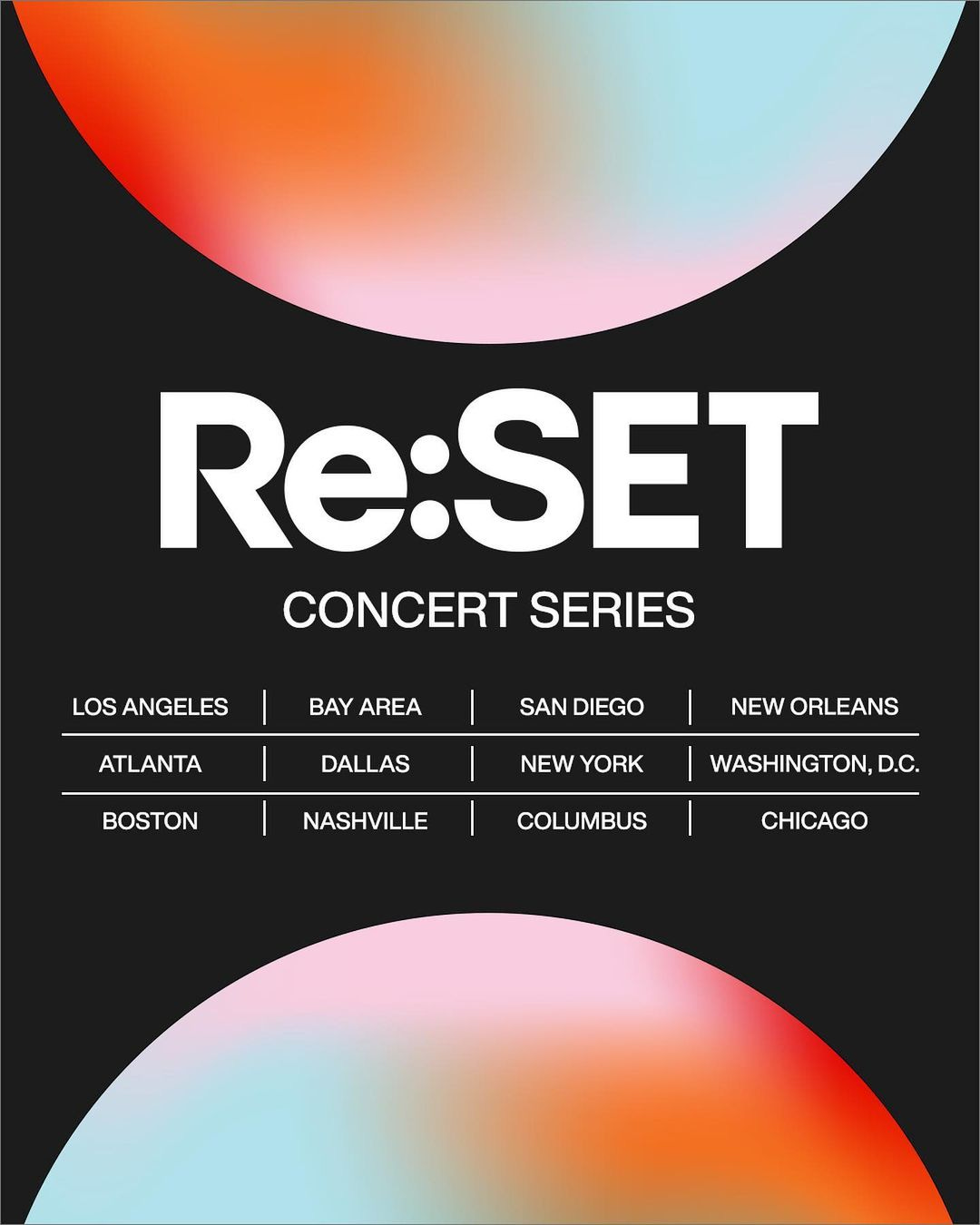
Re:SET Concert Series Identity

The Re:SET Concert Series is a highly-anticipated music event that is held annually in major cities across the United States. In 2023, the event organizers unveiled a new visual identity for the series, and it has been met with mixed reviews from designers and music enthusiasts alike. In this post, we will provide a breakdown of the new identity for the Re:SET Concert Series, analyze its strengths and weaknesses, and suggest some actionable steps that could improve the negative opinions.
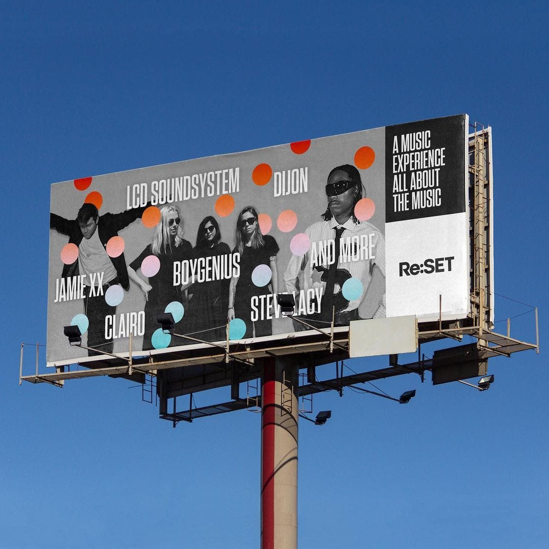
First, let's take a closer look at the new visual identity for Re:SET Concert Series. The identity features a vibrant color palette of deep blues, purples, and pinks, with a bold and modern typeface that uses uppercase letters. The logo is a geometric interpretation of the letter "R," with sharp edges and angular lines. The design is intended to convey a sense of energy and excitement, and to appeal to a younger, more diverse audience. One of the strengths of this identity is its use of color. The palette that is eye-catching and memorable. The bold typeface and geometric logo add to the sense of energy and modernity, making it clear that the Re:SET Concert Series is a forward-thinking and cutting-edge event.
Okay, let's break it down into some simple steps for improving the Re:SET Concert Series identity. It is essential to focus on creating a more cohesive and expressive visual language. One suggestion is to incorporate elements that are unique to the Re:SET Concert Series, such as using typographic expressionism or incorporating musical motifs into the branding. The identity could also benefit from the use of more organic shapes and textures to evoke a sense of humanity and warmth.
Looking to examples from award-winning design studios, we can see how incorporating unique and expressive elements can elevate a brand's identity. For instance, the branding for the Museum of Ice Cream by Jones Knowles Ritchie incorporates playful typography, pastel color palettes, and whimsical illustrations to create an immersive and memorable experience. Similarly, the branding for the Miami City Ballet by Pentagram uses elegant typography, vibrant colors, and bold geometric shapes to convey the beauty and dynamism of the ballet.
Another way to improve the Re:SET identity is to introduce more organic shapes and textures. This can help to make the brand feel more human and approachable, like the way that Patagonia uses hand-drawn illustrations to create a more natural and down-to-earth feel for their brand.

Lastly, it's important to create a cohesive and consistent visual language that can be used across all touchpoints of the Re:SET Concert Series. This means developing a clear set of guidelines for how the brand is presented across different mediums, such as social media, merchandise, and event signage. A good example of a brand that does this really well is Nike, which has a recognizable visual language that is consistent across everything from their advertisements to their shoes. By creating a strong and consistent visual language, the Re:SET Concert Series can help build a stronger sense of identity and brand recognition.
The new visual identity for the Re:SET Concert Series has both strengths and weaknesses. While the use of bold colors and a modern typeface is appealing, the lack of specificity and warmth has left some designers and music enthusiasts underwhelmed. By incorporating more elements that are specific to the Re:SET Concert Series itself, and by creating a cohesive and consistent visual language, the identity could be improved and become more successful in representing the event.